This is
the work.
Brands built from nothing, businesses run, systems designed. This is what it looks like when one person does all of it.
Rock City Roofing
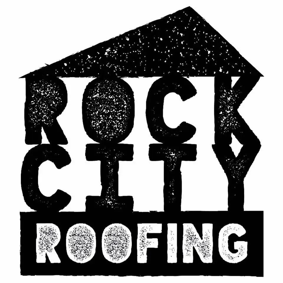
In 2013, with no business experience and no design software, Ron started a roofing company in Northeast Georgia. He designed the logo in a paint program on his mother’s old computer. It was his first logo, ever.
The company ran for three years — registered, EIN in hand, working job sites in 100-degree heat — before he packed up and moved back to the Caribbean. What makes this matter is not the roofing. It’s the fact that from day one, every single customer-facing document, every piece of apparel, every vehicle in the operation carried the Rock City brand. That instinct was already there at 27.
No training. No agency. No direction. Just an understanding that whatever goes out the door should look like it belongs there. That’s the rule he’s operated by ever since.
“Every customer-facing document, every piece of apparel, every vehicle in the fleet had Rock City on it. That wasn’t strategy. That was instinct.”
Monochrome. Maximum contrast. Built to work at any size — on a truck, on a shirt, on a business card in someone’s hand at 100 degrees.
Minimalist architecture. High contrast. Immediate recognition. Built to work on a sign, a shirt, and a truck at the same time. This design philosophy hasn’t changed.
Pour Choices
2024 Present | St. Thomas, USVI + Georgia | pourchoices.biz
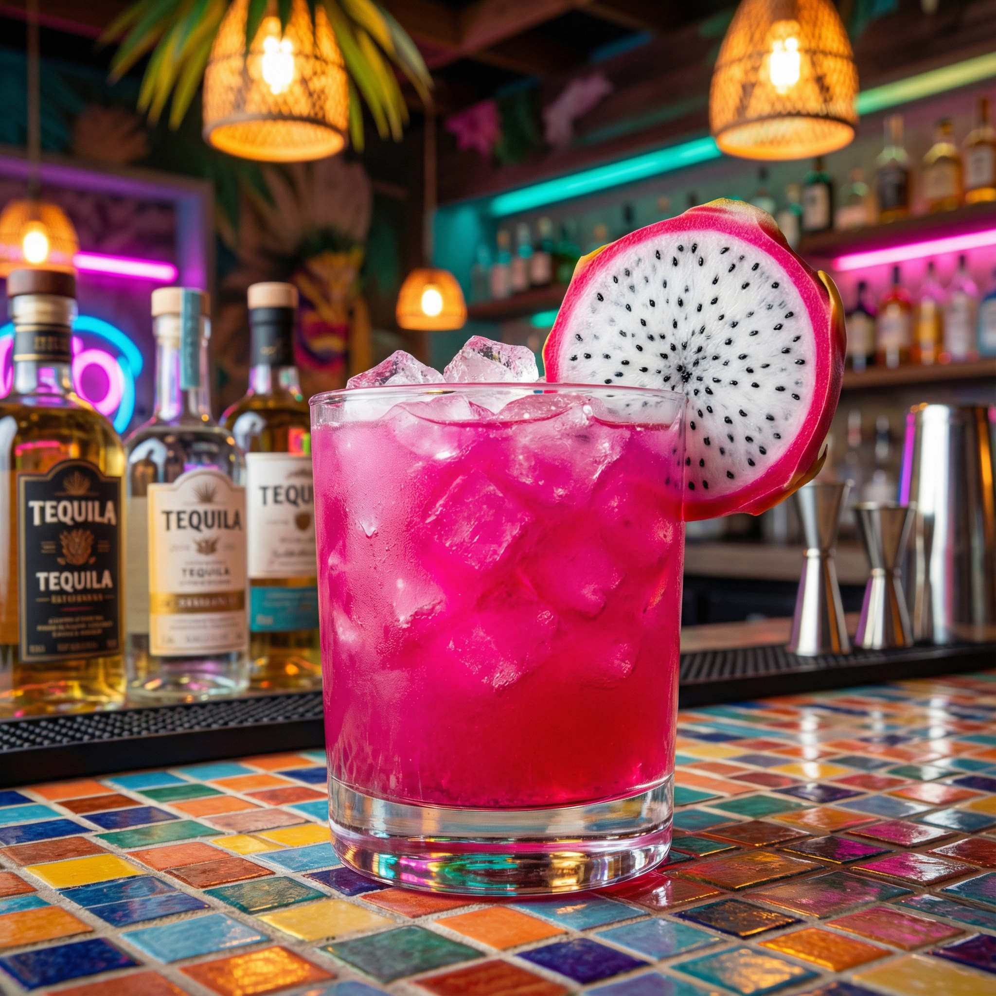
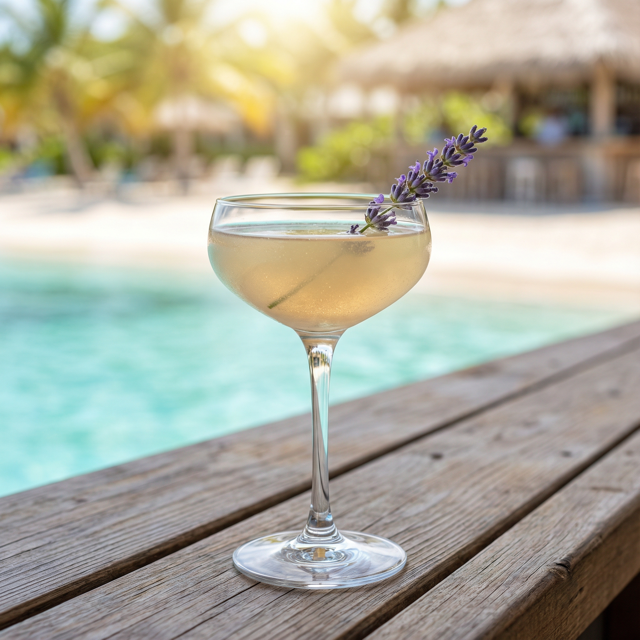
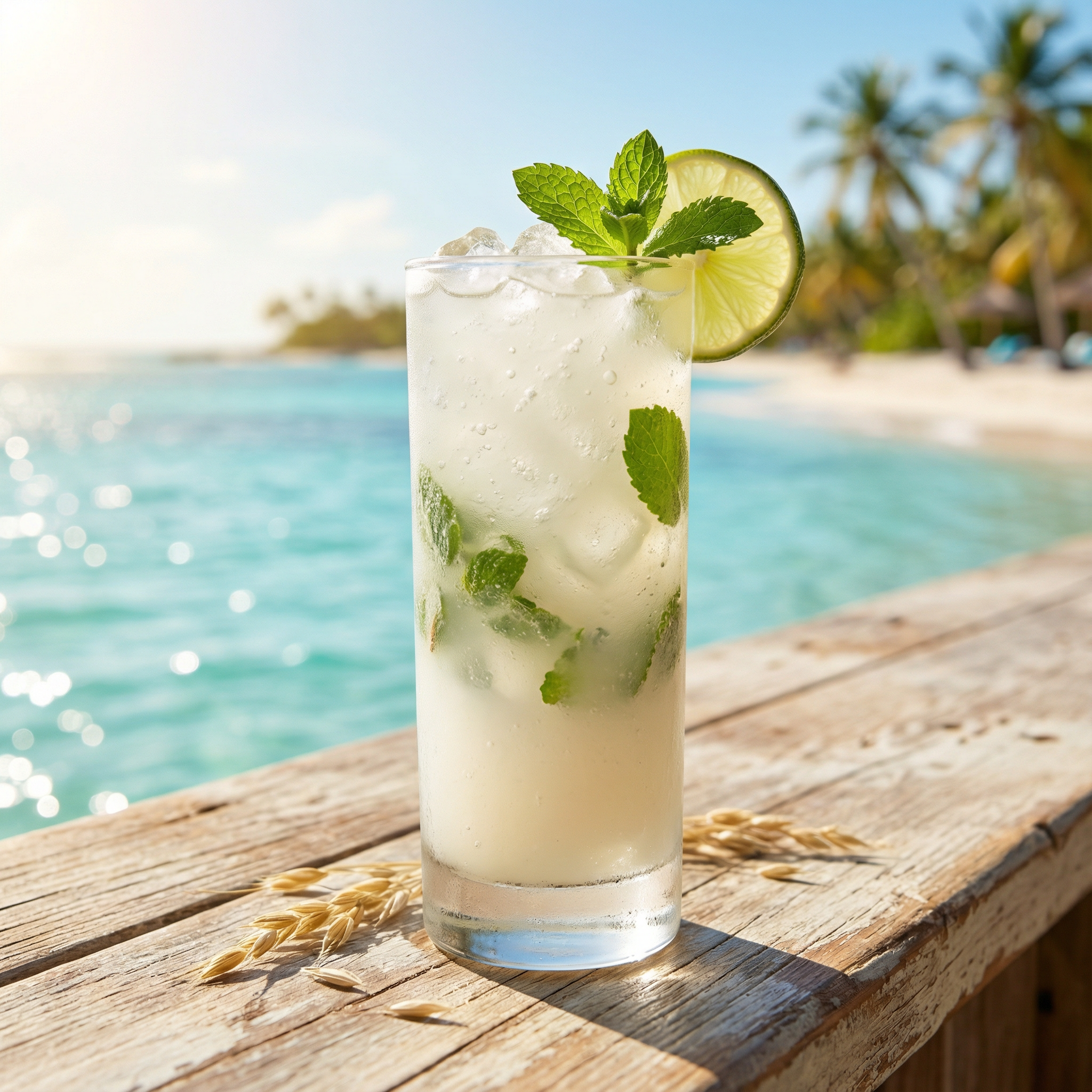
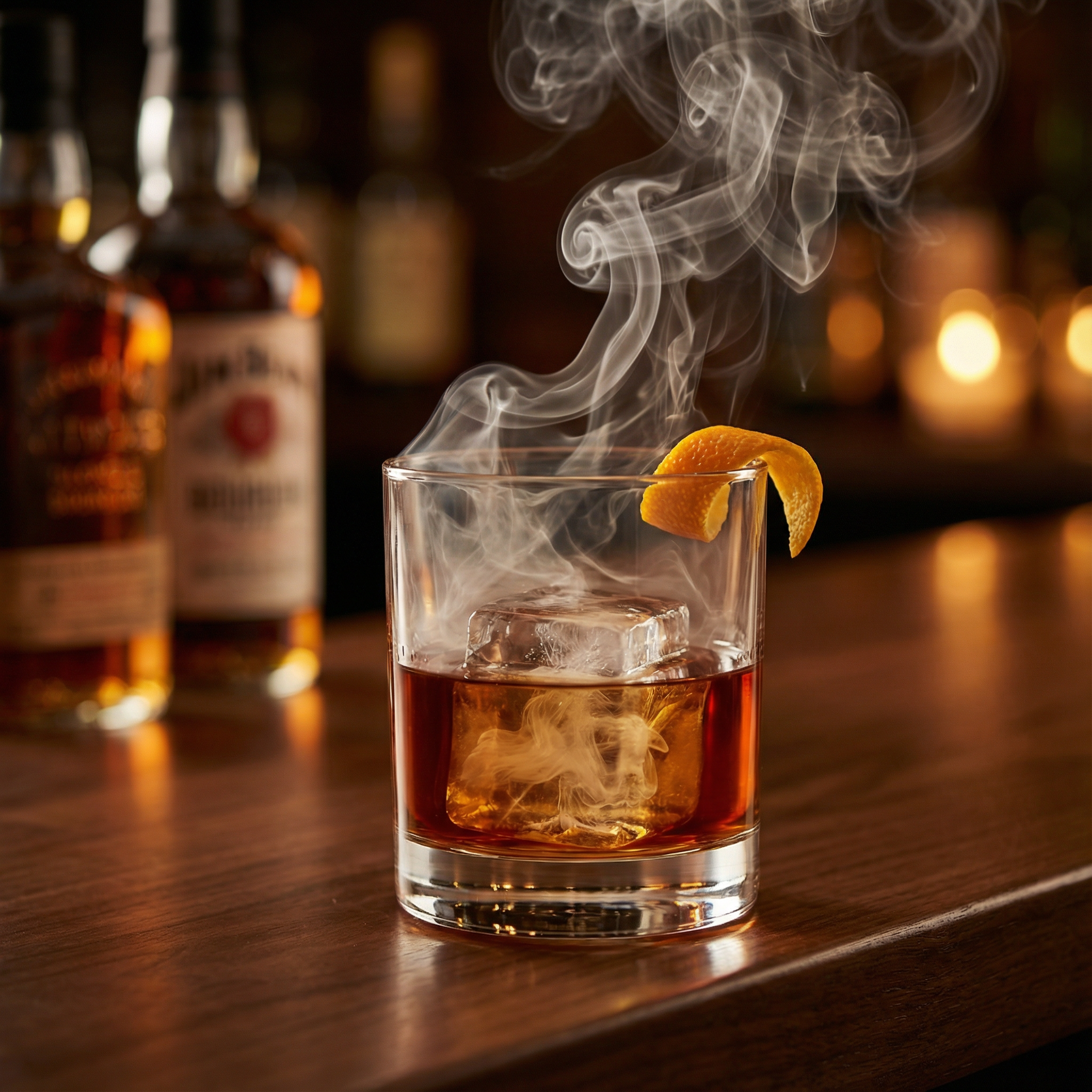
Pour Choices is a craft cocktail experience company. Not a class. A performance. The bar is the stage. The bartender is the performer. Every guest arrives with no idea what they’re about to make, and every guest leaves with something they built themselves and a signed Certificate of Authenticity to prove it.
Ron designed and built every piece of this operation from the ground up — the brand, the business model, the financial architecture, the minute-by-minute performance script, the cocktail library, the sales materials, the website, and the content strategy. He also wrote the book. A full bartender’s manuscript — The Honest Pour — covering hospitality philosophy, technique, and Caribbean cocktail recipes built from 20 years behind the bar.
This is what a full-stack business build looks like. Strategy, identity, operations, sales collateral, content, and product — all produced by one person. Every piece connects to every other piece.
“Every piece of this operation — from the cocktail names to the certificate each guest takes home — was designed, written, and produced in-house. One person, all of it.”
Cream. Charcoal. Coral. Built to feel like the warm side of a Caribbean bar at golden hour. Every visual decision supports the performance — not the product.
The Honest Pour — a full bartender’s manuscript. 6+ chapters. 20 years of Caribbean hospitality put in writing. Because the brand needed a book, so he wrote one.
Groundwork Co
Groundwork Co is a fully operational local marketing consulting firm built for the Hartwell, GA market. Not a concept. Not a pilot. Operational.
Every system is in place. Complete brand, full tech stack (self-taught), proprietary scoring system, and a complete suite of AI-powered client management tools — all designed and built by Ron. Groundwork Co just needs clients and funding. Everything else is already there.
This project demonstrates range that most marketing consultants don’t have: brand identity, economic research, software architecture, AI agent development, and copywriting — all from one person. He self-taught the entire tech stack to bridge what he knew marketers needed and what no one was building for rural Georgia.
“It needs clients. The brand, the systems, the software, the strategy — all of it is done. That’s what a full build looks like.”
“Get found. Look legit. Stay chosen.” Rust signals action. Charcoal signals trust. Cream says we’re not another cold agency — we’re from here.
Shift in food spending identified by Ron’s PESTEL analysis
Uncle Ron Shop
2024 Present | uncleron.shop | WooCommerce + WordPress
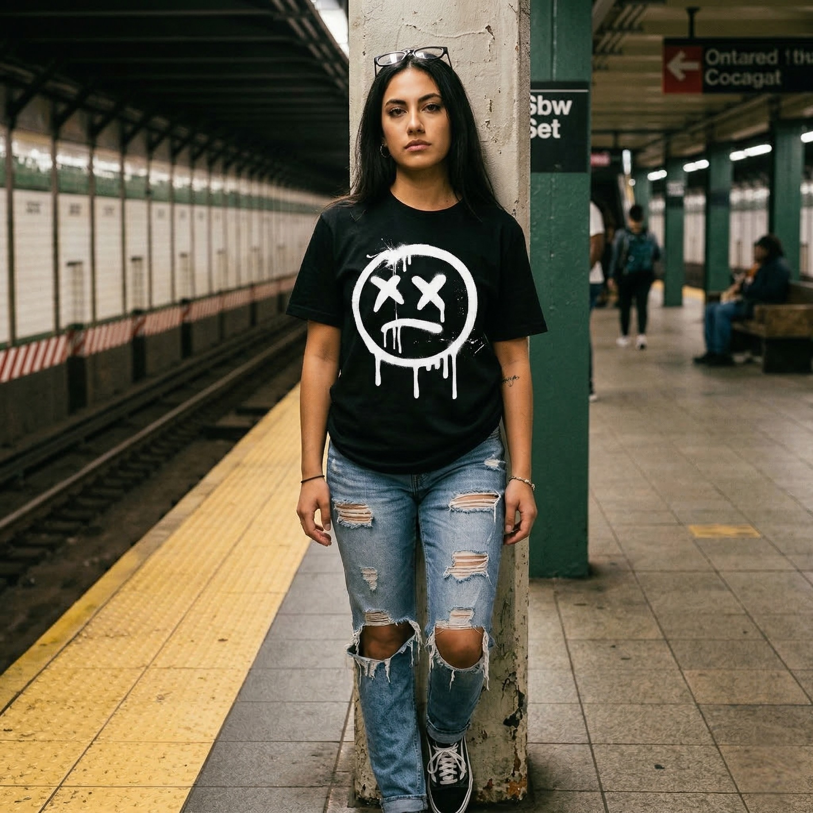
Uncle Ron Shop is a full creative operation run by one person. Every product on the site was designed by Ron. Every graphic, every hoodie, every hat, every tee — made from scratch, tested against a 7-question internal quality check, and published with a custom written product description.
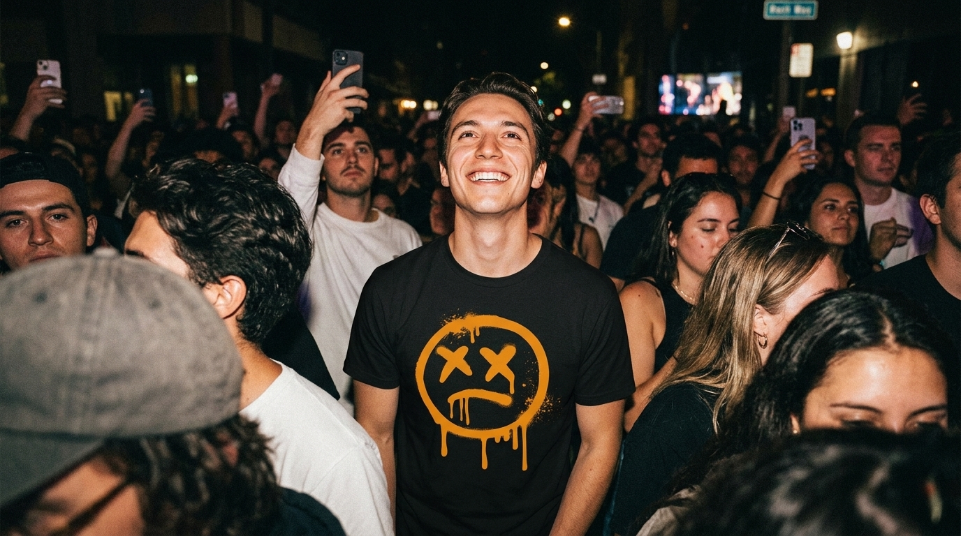
The brand is called Organized Chaos . The design language is stencil + splatter + drips — street poster logic applied to apparel. The graphic language is industrial and intentional. The Mad-Face mark appears on every product. If it doesn’t pass the “Uncle Ron Belongs” test, it doesn’t get made.
The community model starts at zero. The Uncle Ron Patch is free — because the point isn’t to make a sale, it’s to put the brand in hands that will carry it. From there, every product earns its place.
“45 products. Every graphic designed by one person. Every word written by the same person. If I wouldn’t wear it, it doesn’t get made.”
Organized Chaos. Black and white is the foundation. Orange is a punch — never the whole meal. Stencil + splatter + drips. Street poster logic applied to apparel. Every design passes the 7-question test before it ships.
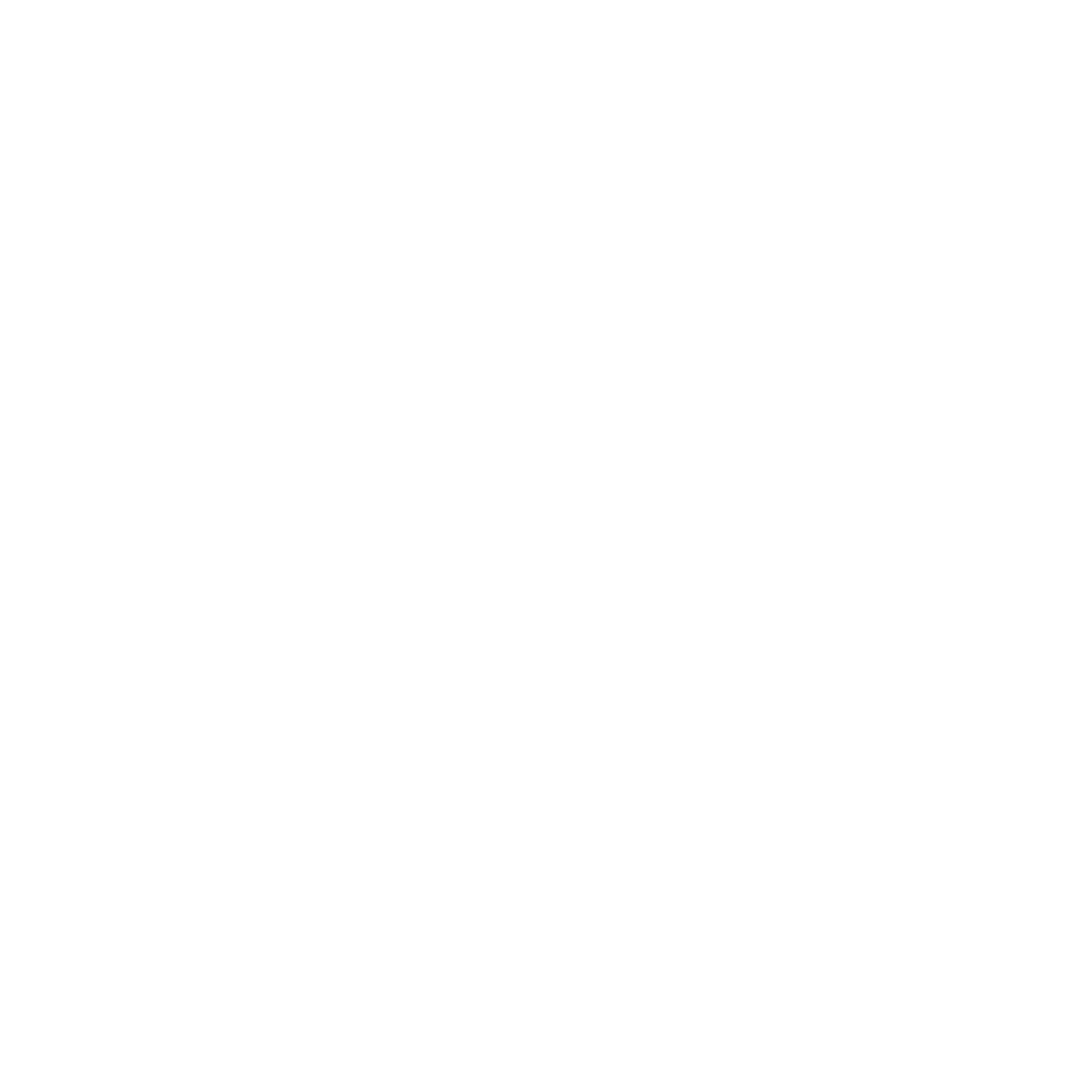
329 Bar & Grill
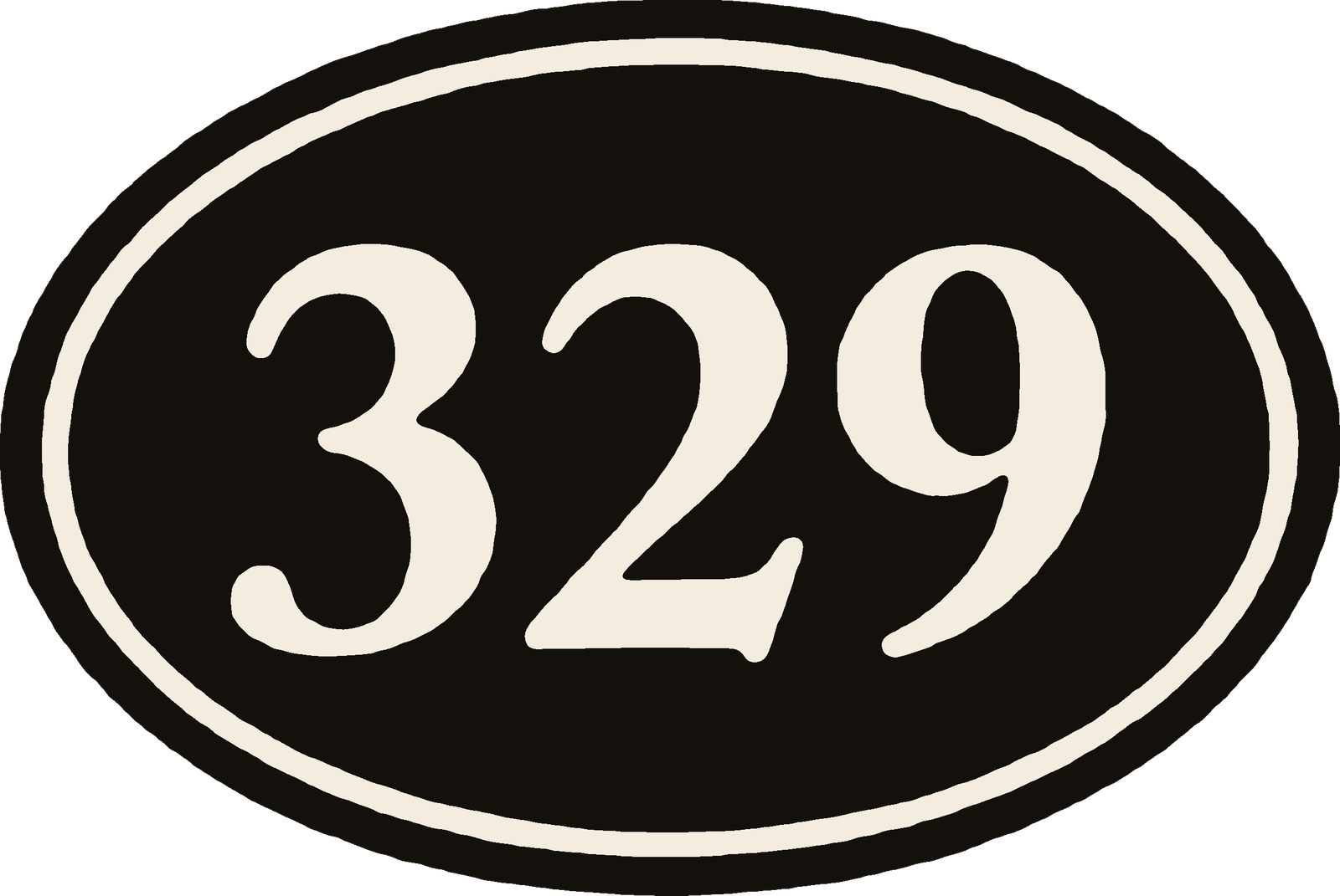
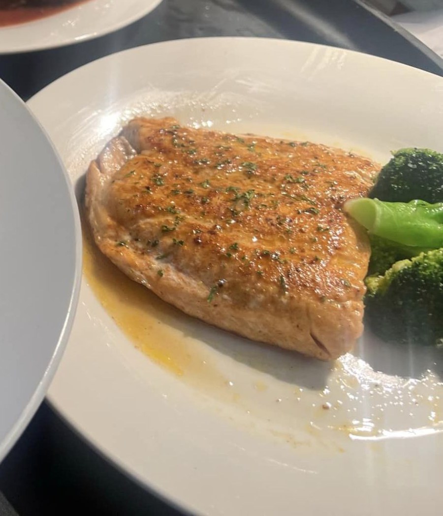
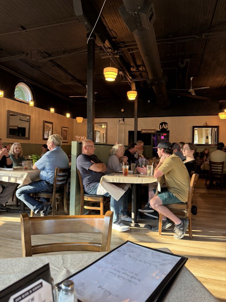
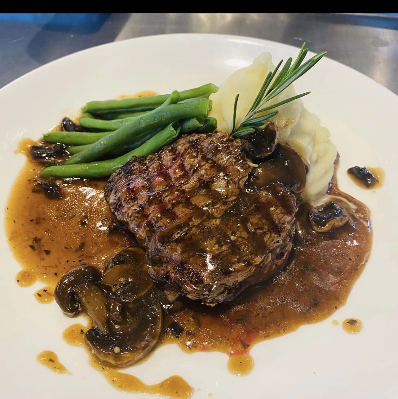
329 Bar & Grill is one of Hartwell’s best-kept secrets a full dinner menu, handcrafted cocktails, and a bar experience that rivals anything in the region. The problem: their digital presence didn’t match what they were actually delivering inside. Generic graphics, no brand system, and a menu printing situation that kept breaking when they needed it most.
Uncle Ron Media rebuilt it from the ground up. New identity system across the full site. An immersive bar experience page built to sell the atmosphere before anyone walks in. A brand-locked print studio so the owner never wrestles with iMenuPro again. A Claude-powered content studio that generates on-brand posts using real 329 photography. This is what a complete digital rebuild looks like not just a new logo, but every system they need to run the business.
“They had the product. They just didn’t have anything around it that said so. That’s the gap we closed.”
Ivory & Ink. The 329 oval mark anchors the identity. A palette built to feel like candlelight on a white tablecloth upscale without being cold. The bar experience deserved a brand that matched it.
Full brand refresh, bar experience page, print studio, AI content system all live and in daily use.
Five brands. Five distinct logo systems. From a paint program in 2013 to AI-assisted design in 2024 — the range is documented, and the growth is visible.
Not just a logo. Color systems, typography, voice guidelines, brand bibles, design rules, and quality standards — built for every project.
Shopify and WooCommerce. Product design, product copy, community strategy, and launch planning — all handled in-house.
SOPs, intake systems, pricing models, BOM documents, performance scripts, client report generators. The business behind the brand.
Want something
like this for
your business?
Twenty minutes. Costs nothing. You keep the report whether you hire me or not.